F O R M  A N D  E X P R E S S I O N
T H O M A S  I N G M I R E
  • Recent works
    • Bela Fawr's cabaret
    • THIS INK THIS BLACK THIS CRY
    • Wind in a Box, after Lorca
    • Terrance Hayes and Dean
  • 2020 books
    • 13 ways of looking images >
      • poem, notes and poet bio
    • Palimpsest images >
      • poem and poet bio
    • Jeu de Marseilles >
      • poem, notes and poet bio
    • Construction on Star Points >
      • poem and poet bio
    • Changing Places in the Fire >
      • poem, notes and poet bio
    • Synovial Things >
      • poem and poet bio
    • Suites Song >
      • notes
    • Cedar Trees on a Hill at Dusk (1) >
      • notes, poem, and poet biography
    • Re-writing Twombly >
      • notes and poet biography
    • Spontaneous Shades >
      • notes, poem, and poet biography
    • Questions
    • Cedar Trees on a Hill at Dusk (2) >
      • notes, poem, and poet biography
    • HUDSON RIVER LANDSCAPE >
      • notes and bio
    • 13 WAYS IF LOOKING AT A BLACKBIRD SKETCHBOOK
  • about
    • 1
    • 2
    • 3
    • 4
    • 5
    • 6
    • 7
    • 8
    • 9
  • gallery
  • Exhibitions
    • Words for Peace >
      • Installations
    • Form and Expression
    • Form and Expression Brunnier Art Museum
    • Things that Dream
    • Sketchbooks
    • Calligraphy and Poetry
    • Thomas Ingmire: Contemporary Calligraphy
    • Visual Poetry: A Lyrical Twist
  • Curriculum Vitae
    • biography
    • solo exhibitions
    • group shows
    • awards and publications
    • collections
  • Publications
    • Codici 1
    • Elvis Christ
  • Blog
  • Teaching Programs
    • workshop schedule
    • correspondence teaching
  • archive
  • 2020 books
  • 2020 books
  • more about this book

THUNDERCLAPS

7/28/2015

0 Comments

 
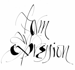
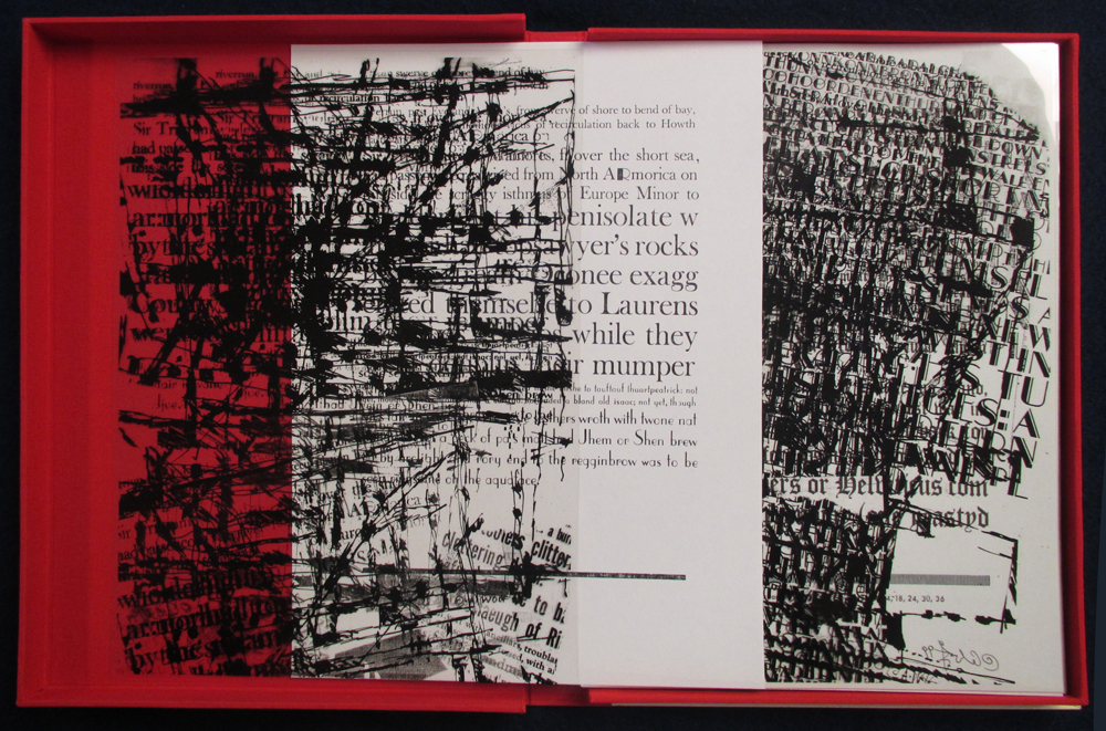
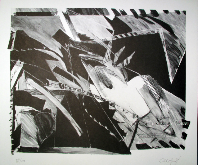
THUNDERCLAPS : A Visual/Verbal Storm 
Calligraphy and Drawing by Thomas Ingmire
Text selections from James Joyce's Finnegans Wake
San Francisco, CA, 2014
Unique Book
12” x 13.5”,  24 pages Including cover, 
 Acrylic on Mylar with gold leaf illumination

THUNDERCLAPS in FINNEGANS WAKE are invented words that are 100 letters long. Joyce included ten; the final one was actually made up of 101 letters.  These “words,” which are wonderful to read out loud, interplay with abstract calligraphic marks created in response to selections of music and readings that are part of the Wayword and Wordsigns project.  

The drawings in the book were inspired by creatures depicted in the Book of Kells. Aside from the Irish connection with Joyce and his reference to the book, Kells reminds us of the magic of the written word to stand merely as a visual image. Like the Book of Kells, the book invites the viewer to experience its visual splendor, and in reading, to the “hear” the music of the language.  


0 Comments

Finnegan's Facebook

1/22/2015

0 Comments

 
FINNEGAN'S FACEBOOK
Calligraphy and Drawing by Thomas Ingmire
Text selections from James Joyce's Finnegans Wake
San Francisco, CA, 2014
Unique Book
6" X 7 3/4",  38 pages housed in a plexiglass box 

While visiting the Bancroft Library on the UC Berkeley campus, I came across a manuscript  which had a collection of delightful Blackletter capitals that were decorated with amusing drawings of faces. This became the inspiration for the November 2014 Cafe Chronicles book.  The large capitals were initially created  in my studio followed by the drawings which were made each morning  at Cafe Puccini. The text passages, selections from Finnegans Wake, were added back in the studio. This book is the closest I come to having anything to do with the real world FACEBOOK (thumbs down).
0 Comments

Remembering Arne Wolf

10/28/2014

7 Comments

 
Arne Wolf, an Artist, teacher, and calligrapher passed away in the summer of 2013. He was a key figure in the San Francisco Bay Area calligraphy and book arts world. And for me, he was the most  influential person in the development of my experimental work and my exploration of calligraphy as an expressive art form. His words from critiques and lectures constantly served to challenge and inspire my work. Quotes from my journals follow. They are excerpts from an article I wrote for the FOC Autumn 2014 Journal (Volume 40, no.1).

On reconciling issues of lettering and art….

 “It is difficult to work on both sides of the issue. It is a painful process to move away from or to give up what has been drilled into us. As one moves toward art–– the logical extension is to give up lettering and move into painting.” 

Picture
In his discussions on lettering and art, he couched his arguments in terms of the philosophical dichotomy between Apollonian and Dionysian which is inspired by Greek mythology. Dionysos, the god of the grape harvest, winemaking and wine, of ritual madness and chaos, contrasts with Apollo, the god of reason and the rational. When it came to calligraphy and art, Arne was a Dionysian man; a proponent of freedom and expression. 

“Visual splendor is Dionysian, legibility is Apollonian.” 

The Lindisfarne Gospels, a wonderful example of visual/verbal fusion is Dionysian while a page of capital quadrate is Apollonian. The Romans were “straight arrow”logical and controlled, not aesthetic (Apollonian), while the Greeks were the artists. Roman letters (Apollonian) are not emotional, but conservative and rational. The idea that an alphabet has to be uniform was a Roman idea. When the division between the text and image is clear, as in Renaissance manuscripts, the work is Apollonian. 

“The Renaissance looked backwards and was clarifying; it was not a revolution.” 

Arne viewed the Renaissance as a pragmatic period leading to typography which took the mystery out of writing. By contrast, the work of the Baroque period (Dionysian), free and exciting, was a swing against authority and pragmatism.


THE BATTLE BETWEEN DAVID AND GOLIATH  15” X 25 1/2” lino cut.  This is one image of ten sheets that are presented loose in a portfolio box.
 
Picture
THE FIRST JOKE OF WILLINGDONE from Finnegan's Wake by James Joyce: Set in the Form of an Inventory of the Metal and Wood Typefaces in the Printing Studio of Arne Wolf Interspersed with Textual Textural Typographic Drawings

“Every good work of art has a quality of redemption.”

“I love ambiguity as a springboard for the imagination.”

“Historically the most creative work in lettering has involved capital letters. Minuscule writing has served more practical purposes.”

“The urge of the artist is to do something different––to change change. For anything to be art it has to be new.”


Arne described that the work of an artist had to grow out of passion and conviction. It is internal and involves putting one’s soul into the work. Commercial calligraphy, by contrast, is driven by external forces and this takes it out of the realm of being art. 

“Work comes from an impulse (time and precision has nothing to do with this).”

Picture
 LOVE SHAKES MY HEART   A limited offset edition in black and grey tones by Arne. 100 images were signed, 100 without signatures. I remember seeing original paintings similar to this by Arne. The works were examples or Arne’s interest in visual/verbal fusion. He felt that lettering within a painting worked best if it was made by a mechanical means (usually stencil or rub on letters) as opposed to a calligraphic hand writing. A calligraphic hand and the expressive painting would always seem to be visually in conflict.


On the meaning of “content” Arne presented a number of thoughts:

“The transition from craft to art is equal to the movement from making letters to making content. Content equals the whole message, not just the verbal message.” 

“Letters are not human, but content is human.”

“Letters don’t give meaning, but the human does.”

“Words are expressed through letters, but content is not.”


On Books

“The definition of the so-called artist’s book is of absolutely no importance to me.”


7 Comments

A gift from Fanny Renoir

7/8/2014

1 Comment

 
This work is a gift from Fanny Renoir, a San Francisco Cafe Puccini  "Outsider" artist. I think the work is a wonderful example of the fusion of lettering and image. I wish that I could say that I did it. I am thinking however to use this as my next "business" card.

Picture
1 Comment

    Archives

    May 2019
    November 2018
    October 2018
    August 2018
    August 2017
    January 2017
    October 2016
    September 2016
    August 2016
    April 2016
    March 2016
    January 2016
    November 2015
    October 2015
    August 2015
    July 2015
    May 2015
    April 2015
    March 2015
    January 2015
    December 2014
    November 2014
    October 2014
    August 2014
    July 2014
    June 2014
    May 2014
    April 2014
    March 2014
    February 2014
    January 2014
    December 2013
    November 2013

    RSS Feed

    Thomas Ingmire

    I I like the words of the poet, Juan Ramon Jimenez, "if they give you lined paper, turn it sideways." For calligraphy to become relevant in the modern world, it seems to me that it must embrace the ideas behind these words. The works in this section of the website will represent my endeavors to explore new boundaries. 

    Categories

    All
    Cafe Chronicles
    David Annwn
    Ekphrasis
    Expressive Calligraphy
    Jackson Mac Low
    John Cowey
    Poetry Collaboration
    Robert Sheppard
    Visual/verbal Fusion
    Words And Images